Van Gogh Colour Relief
07 Assignment: Colour Relief -with refined presentation poster-
Here, I want to share with you the poster which we were expected to refine and also add some informations to make it more informative presentation poster. To achieve this i used some explanation parts, and also dissolving regulating lines which are used to emphasize hyerarchy. I choosed dissolving lines to use, because it’s good that an eye automatically completes the lines, so again they’re same but not with so much strong, just as linear elements put there. Here are:
- The Informative Presentation Poster
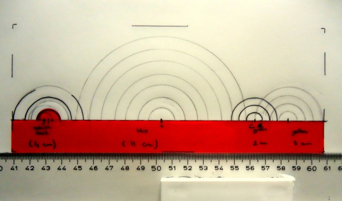
- From Progress: Orthographic projection which i drew to guide me the strips & circles, basic sketch. I did the sketch-like projection of my idea first, because i couldn’t know that if it will work or not. But when i calculated the raiusses of the circles by a reference from Gogh’s colour use percentages on Starry Night and i drew them all, i saw that it works. And i want to add something also, the overlapping parts between the different colour parts are defining the colour transitions he used. when they overlap, from the right angle you are being able to see other colours appearing because of his use of colour.
- The project itself


